When authors and editors understand the purpose of different typefaces and sizes, they can better attune their style choices to their goals and audience.
Editing occurs at every stage of an article’s publication, from writing, to substantive editing, to copyediting, and even to making design choices. However, as we prepare to finalize text for publication, we often forget that the visual presentation of text is not just a finishing touch but a crucial step in the editing process. Being more aware of effective uses of typography and understanding the role of font size can help editors provide greater value to their projects and keep the audience’s needs (and the project’s medium) in mind through every step of the writing process.
THE RESEARCH
In David Beymer, Daniel Russell, and Peter Orton’s 2008 study “An Eye Tracking Study of How Font Size and Type Influence Online Reading,” published in the proceedings of the 22nd Annual British Human-Computer Interaction Conference, the researchers identified how reading speed is affected by typography and font size. To do so, they selected 85 participants between the ages of 30 and 50 and had them read a selection of text in varied font sizes of the serif font Georgia or the sans-serif font Helvetica on a web-page style screen. These fonts were selected because their only perceivable difference was the addition or lack of serifs. The three factors for reading speed included overall speed, fixation duration, and return sweeps. (Fixation duration is the brief period of time where individuals focus on one single word, while return sweeps are the length of time readers take to transfer eye movement from one line of text to the next.)
Their findings indicated that a 10 point font led to a greater fixation duration, while anything above 14 point font increased the length of return sweeps. The researchers stated, “We feel that a combined measure of speed and preference would probably select the 12 pt font” (Beymer, Russell, and Orton 2008). Regarding font type, there were no statistically significant results for differences in either reading speed or retention. However, the researchers noted that the serif and san-serif typefaces used in the study were very similar.
“We feel that a combined measure of speed and preference would probably select the 12 pt font.”
Beymer, Russell, and Orton (2008)
THE IMPLICATIONS
Editors and publishers who understand the relationship of font size, typography, and factors influencing reading speed can help tailor their design choices to the audience. They can choose to decrease font size for small portions of text where individual words carry more weight. A larger font size will decrease unnecessary fixation on that portion of text. For other types of information, editors and publishers may also advocate for larger font sizes to encourage longer return sweeps to signify the information as distinct or less connected to the lines of text above. Greater awareness of the physical presentation of text can then be used to enhance the content and bring more value to an audience. By viewing typography and font sizing choices from a practical standpoint, editors and publishers can better tailor their choices to reflect their desired impact on audiences.
The researchers also noted that, despite the insignificant results of the typefaces, an author or editor choosing between serif and sans-serif fonts should take into account the medium in which the final version of the text is to be distributed. Serif fonts were intended originally for printed media to help the eye follow the line of text. However, many sans-serif fonts were intended for digital media, as the pixels appear clearer on a smaller screen. Considering the method of distribution is therefore crucial when making design choices.
To learn more about eye tracking and the relationship between reading speed and font choices, read the full article:
Beymer, David, Daniel Russell, and Peter Orton. 2008. “An Eye Tracking Study of How Font Size and Type Influence Online Reading.” In People and Computers XXII : Culture, Creativity, Interaction: Proceedings of HCI 2008: The 22nd British HCI Group Annual Conference, Liverpool John Moores University, UK, 1-5 September 2008, by D. England, O. Abuelmaatti, and R. Beale, 15–18. Electronic Workshops in Computing, v. 2. British Computer Society https://doi.org/10.14236/ewic/hci2008.23
—Cala Taylor, Editing Research
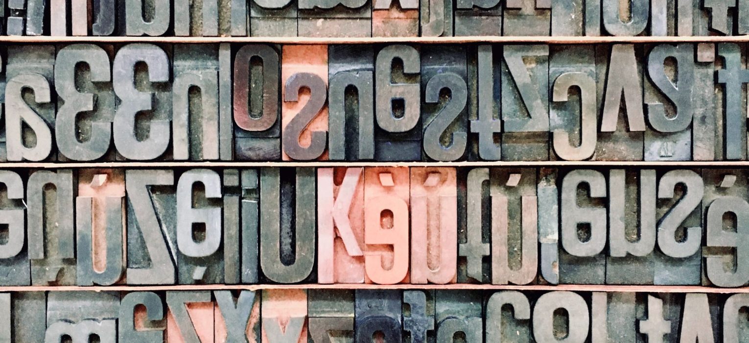
FEATURE IMAGE BY FABIO SANTANIELLO BRUUN
Find More Research
To learn more about typography as it relates to online publications, read Hojati and Muniandy’s article: “The Effects of Font Type and Spacing of Text for Online Readability and Performance.” Contemporary Educational Technology 2014 5 no. 2 (2014): 161–174. https://doi.org/10.30935/cedtech/6122
Take a look at Bernard, Liao, and Mills’s article to find more information about how to make text legible for older adults: “The Effects of Font Type and Size on the Legibility and Reading Time of Online Text by Older Adults.” In CHI ’01 Extended Abstracts on Human Factors in Computing Systems, 175–76. CHI EA ’01. New York: Association for Computing Machinery. https://doi.org/10.1145/634067.634173


Hope Jones
I always knew 12 pt font was the standard but it was really cool to learn why. I didn’t know that so much research and attention to detail went into these specific stages of editing. Thanks for the information!
Ben Tickle
Very useful and informative article. This helped me a lot. Thank you.